';
Powered by Blogger.

How I proved there are no rules in color!

Some days I put on my lab coat and conduct color experiments.  These are my notes from yesterday's experiment...


Using Adobe Illustrator I pulled up a photo of one of my stitched designs.  


Using the most fabulous Eyedropper Tool I pulled 24 colors out of the my stitched design and placed them into identically sized squares.  Here are the squares:


I took the squares I had pulled and mixed them up. I placed the colors underneath the first batch in different order.  I also took the same colors and changed the number of rows and columns on the board.  I asked myself:  Did each of these groupings look different?  Did they seem to have different colors? Not clear.
Next I took the color group and set it up in a random shape, placing the colors in different sequences.
I changed the sizes of the squares as well, some becoming larger rectangles and some only slivers of color. Once I completed two different combinations I added a background to each of the combinations using a background color from my groupings.
What interesting combinations!  

Looking back at the original group of colors I wondered; should a rosey pink look good with a elephant brown? How about a lilac purple with a bright yellow? Would they seem like a good place to start for a bright upbeat elegant piece of wearable art?  I wouldn't expect them to.


I went back to my original group of colors and decided to play with them in different sizes and shapes and see if I could come up with a beautiful sophisticated design and color combination.  I came up with this, using my colors only.

My very scientific conclusion is... there are NO rules in the world of color.  Each and every rule you bring to the table can be disproven!  Each and every time you say that a group of colors don't go together, there is bound to be a way in which the colors will look fabulous together!!  

BTW, here is the piece I used to pull my colors in the first place, Capital Jewels Cuff revisited :
I never knew I like science this much!!  ðŸ˜‰

Read more...

How I make my stitch choices on painted canvas?

Before I answer that question, I would like to categorize the type of stitch choices that can be made when stitching a painted canvas.  As with anything else, you can categorize the same thing in many ways, so for instance let's take dresses as an example...  I can categorize dresses using lengths as my category scale, (mini, knee length, maxi etc.), or I can use season as the category, (summer dresses, winter dresses, transition dresses), or maybe even colors, (bright colors, white dresses etc.). Each of these categories make sense and are good indicators, it's just a matter of what I'm attempting to differentiate.  
I am going to use this following indicators for categorizing stitches to use on painted canvas:

Realistic stitching - stitches I choose to use in order to achieve a painted canvas which looks as realistic as possible.  
Technique stitching - I will use as many types of stitches as I can and in this way turn my canvas into a teaching piece of sorts.  
Simple stitching - or what I like to call TV stitching.  This would be mostly basketweave that uses the painted image as an exact guideline to produce the image as close to the painted version as possible. I can stitch this type of piece while watching TV, hence the name. Here I don't want to be distracted by complex stitching, I just want to have a stitched piece that is an exact copy of the painted piece.
Artistic stitching - This style is meant to create a finished piece that is most appealing as a piece of art when completed.  My aim is not to show how advanced I am in stitching techniques, not to replicate the painting as accurately as possible, and not to make the piece into a snapshot of a very realistic scene.  Here I am aiming to bring a total result that is my artistic interpretation of the canvas.

The various categories are not being judged here in any way!  This is a personal choice, each stitch guide produced is how this person approaches the particular canvas.  I definitely am drawn to one approach, the Artistic stitching choice, but that's me, and it is in no way better than any other choice. The category I am drawn to guides how I make my stitch choices.  


Here, in my painted canvas of the Pheasant, I want the bird to clearly look like a pheasant, but not realistically so. I am interested in the overall beauty of the textures, of the way the fibers speak, of the interesting use of materials and at the end of how pleasing the result is to the onlooker.  I didn't use complicated stitches, I used interpretive stitches which allowed me to achieve an end result that strongly implied a Pheasant, but stayed true to the overall artistic approach.  

Do you have a favorite category?  Is the category you like stitching the same as the category you like gazing at? I'd love to hear from you!


Read more...

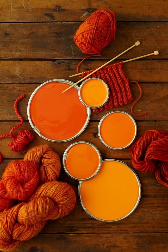
How about some colors for the beginning of a fantastic week!!


I love how on May 1st, 2012 I posted this...


Read more...

Ana Teresa Barboza

I enjoy bringing to you fiber artists I come upon, but usually don't like to add much verbiage to these posts.  I prefer to let you determine how you feel about the works I bring to you.  Here is Ana Teresa Barboza:


Read more...

About This Blog

©Orna Willis
All images, text, and content on this site are the sole property of Orna Willis and may not be used, copied or transmitted without the express consent of Orna Willis. Any other inquiries please email me at orna@ornadesign.com

Blog Archive